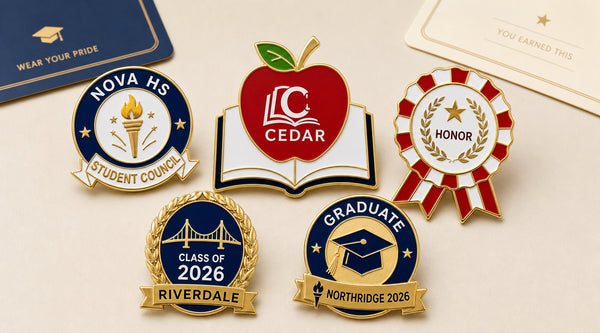
A school logo that looks strong on a website, banner, or uniform may become crowded when reduced to a small pin. Fine crest lines can merge, a mascot's expression can disappear, and a long school name can compete with the award title or class year.
The solution is not to remove everything distinctive. It is to decide which visual element makes the school recognizable, give that element enough room, and move secondary information into the layout's separate wording areas or onto the presentation card.
Why Detailed School Artwork Becomes Difficult on a Pin
School identities often contain several elements: a shield, founding year, motto, mascot, book, torch, laurel branches, and the full institution name. These details can coexist on a large seal because viewers have room to inspect them. On a pin measuring about one to 1.25 inches, each additional element reduces the space available for everything else.
Small lettering is usually the first problem. Thin outlines, facial details, feathers, and overlapping color areas can also lose separation. Adding an award title, council role, club motto, or class year creates another layer of competition.
Treat the pin as a compact version of the school identity—not a miniature copy of every item in the brand guide.
Decide Which Part of the Identity Must Be Recognized First
Before adjusting the artwork, answer one question: what should a student, parent, teacher, or alumnus recognize first?
Use the Main Symbol
If the school is known by a shield, torch, tree, star, book, or mascot head, use that symbol as the center artwork. A single strong mark is easier to recognize than the complete crest surrounded by tiny text.
Use Initials When the Full Logo Is Too Detailed
Two or three school initials can be effective when a detailed mascot or long wordmark will not reduce clearly. Initials can sit inside a shield, circle, book, apple, or other designated artwork field without asking the viewer to decipher miniature lettering.
Keep the Full School Name in a Separate Text Area
Some established layouts provide a curved outer ring or separate ribbon. Use those areas for the school name, program name, or award title instead of placing every word inside the center emblem. This creates a clearer hierarchy: identity in one area, purpose in another.
For a broader look at how different school programs can use established layouts, read School Pin Ideas for Students, Clubs, and Academic Awards.
Simplify a School Mascot Without Losing Its Character
A full-body mascot illustration may include a uniform, props, motion, shading, facial features, and several outline weights. At pin size, the pose and small accessories may be less important than the features students immediately associate with the character.
Start with the mascot's most recognizable view. A clear head, profile, paw, wing, horn, or other signature feature may preserve more identity than a full scene. Retain a few defining shapes, use solid color areas, and remove background objects that are not essential.
Do not replace the approved mascot with a generic animal simply because it is easier to draw. The simplified version should still be reviewed by the person responsible for the school's visual identity before it is submitted for production.

Match the Artwork to an Established School Pin Layout
The available School Pins use established outlines with different artwork and wording areas. Choose the structure that naturally supports the program.
Open-Book and Apple Layouts
The open-book academic design provides a broad central face for one logo or academic symbol and a separate ribbon for a short award title. The apple-and-book teacher design works best with initials, a simple school mark, or a compact staff emblem inside the apple.
Round Seal and Graduation Layouts
The student council seal separates the school name, center emblem, and lower leadership label. The round graduation design gives the curved ring to the school name and reserves the center and lower banner for graduation imagery and the class year. These divided areas can solve the problem of a long school name competing with the main symbol.
Rosette, Laurel, and Scroll Layouts
The rosette emphasizes one central award symbol and concise achievement wording. The laurel-framed class design gives priority to the year. The horizontal club scroll provides separate lines for an emblem, club name, short motto, and year. Match the artwork to that existing hierarchy instead of trying to force the same complete crest into every design.
Limit Wording Before Reducing Letter Size
When text does not fit, shorten it before making it smaller. Use recognizable forms such as NORTHRIDGE HIGH instead of a long legal institution name when the school has approved that wording. Keep one concise award, council, club, or graduation message in the designated text area.
Move individual names, full mottos, dates, explanations, and congratulatory messages to a Custom Printed Paper Card. The pin carries the identity; the card provides the context.
Use School Colors With Enough Contrast
Choose the colors that most strongly represent the school and help the artwork separate from its background. A dark outer ring with light lettering, or a light center field surrounded by a darker school color, can make the identity easier to read.
Gold offers a warmer outline, while Silver gives the same layout a cooler frame. Review how the selected school-color enamel areas interact with the metal finish. A color palette that works on a bright screen may need clearer light-and-dark separation when shown at actual pin size.
Prepare Artwork and Approval Details Before Ordering
Use the school's authorized artwork rather than downloading an unofficial version from a search result or social profile. Confirm which logo, mascot, initials, school name, and colors are current. If a department, club, parent group, or graduating class is placing the order, identify who has authority to approve the school mark and final wording.
Submit the clearest available source artwork along with written instructions. Label which element belongs in the center, which wording belongs on the ring or ribbon, and which details may be omitted if they do not remain legible.
Review the Digital Proof at Actual Size
A digital proof should be checked both enlarged and near the finished dimensions. The enlarged view helps catch spelling, missing artwork, and incorrect colors. The actual-size view shows whether the mascot, initials, and wording can be understood without zooming.
Ask reviewers to check the approved identity—not just whether the design looks attractive. Compare the proof with the submitted school file, confirm every letter and year, and keep the approved version with the order record.
School Logo Pin Artwork Checklist
- Confirm authorization to use the school logo, crest, mascot, or initials.
- Select the one symbol that should be recognized first.
- Remove fine background details that do not support that symbol.
- Shorten wording before reducing the letter size.
- Assign the school name, award title, and year to separate layout areas.
- Limit the palette to clear school-color enamel areas with useful contrast.
- Choose the established pin layout that fits the program message.
- Review spelling, artwork, colors, and finish in the digital proof.
- Inspect the proof near the stated finished size before approval.
- Save the final approved proof for future reorders and related programs.
Frequently Asked Questions
Can a detailed school crest be used on a pin?
It may need to be simplified. Preserve the main shield or symbol, remove fine background details, and place the full school name or motto in a separate wording area or on a presentation card.
Can we use a school mascot instead of the full logo?
Yes, when the school authorizes that artwork and the mascot remains recognizable after simplification. A mascot head, profile, or signature feature often reads more clearly than a detailed full-body scene.
How many colors should a school pin use?
Use the school colors needed to keep the main symbol recognizable and create clear contrast. More colors do not automatically create a clearer result. Review the proposed enamel areas and Gold or Silver outlines in the proof.
What if the school name is too long?
Use an approved shortened name or initials in the pin artwork, then place the full institution name on the presentation card or packaging. Do not reduce the lettering until it becomes difficult to read.
Can the outer shape be changed to match the logo?
The School Pins collection uses established outlines such as an open book, apple, round seal, mortarboard, rosette, laurel-framed oval, and scroll. Choose the base layout that best fits the identity, then personalize its designated logo, wording, and color areas.